"Wicked Felina" oil panels in oak screen SOLD
Wicked Felina is my second (and probably last) Craftsman-style folding screen. It was inspired by the classic Western song, "El Paso" by Marty Robbins. The screen was designed by myself, and crafted by Holton Studio Frame Makers in Berkeley, CA.

I wanted a simple, Craftsman style look and Tim Holton nailed it with dark-stained, quarter-sawn oak and gold leaf trim. The panels are connected with antique-style hinges complete with flat head screws. Overall measurement is 69" high by 97" wide when fully extended.

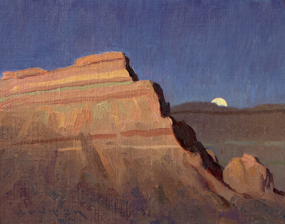
Panel 2 (20x24)
Robbins' Grammy-winning song was a huge cross-over hit on both Pop and Western radio stations across the country in 1960, the year I was born. It just seemed like a perfect vehicle to do a sequential, one-of-a-kind collection of oil paintings, housed in a working piece of finely-crafted furniture.

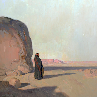
Panel 3 (20x24)
The above scene (panel 3) depicts the protagonist after he has stolen a horse, fleeing the cantina... If you look closely at the posse following him, you will see "the white puff of smoke from the rifle", an integral lyric from the song~

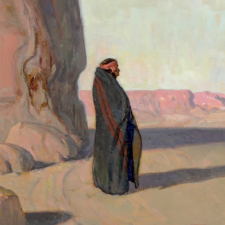
Panel 4 (20x24)

Fully Extended (69x97)
The figures for the scenes were modeled by my good friend, Roger Smith, and my niece, Madison Aldridge who both did a stellar job~


%20copy.png)
%20copy.png)
%20copy.png)
%20copy.png)
%20copy.png)
%20copy.png)


%20copy.png)

%20copy.png)


%20copy.png)

%20copy.png)
%20copy.png)

%20copy.png)

 (
(